Basic Power BI report with Cross filter functionality and Edit interaction
Level : Beginners
Agenda: This blog explains the creation of basic Power BI report using cross filter functionality and edit interactions.
Prerequistics : Power BI desktop, Excel sheet with input data
Downloadable Contents : Input – Excel File
Illustration
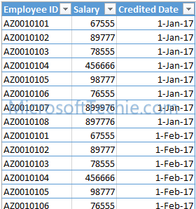
We are going to design Power BI report for employees. We have an excel sheet with two tables, in which table 1 has the personal information of the employee whereas table 2 will have the salary information of the employee. These two tables are linked with “Employee ID” field.
Table 1:
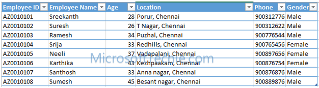
Table 2:
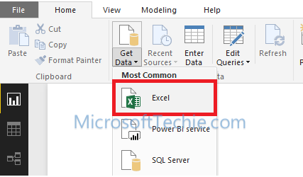
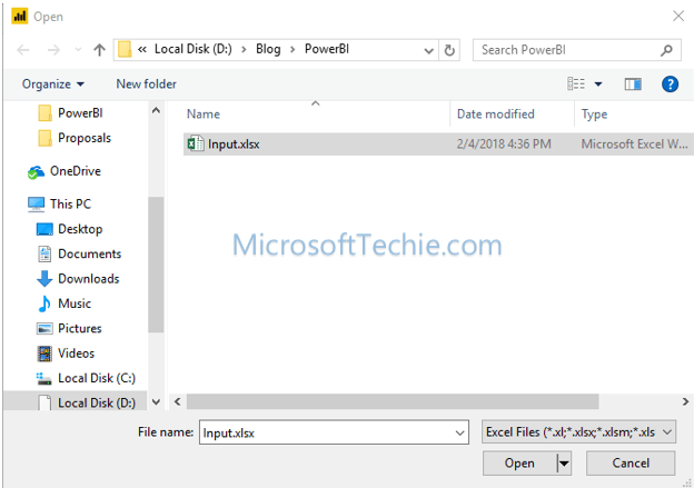
Step 1: Open the Power BI Desktop software and click “Get Data” –> “Excel”.
Step 2: Open dialog box allow user to select the input file in excel sheet format. Select the input file and click OK.
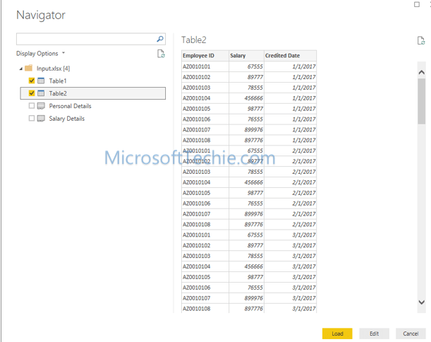
Step 3: Navigator form appears as shown below. It allows user to select the input data from the excel workbook that was selected. Tables and sheets in the input workbook will be populated. Click “Load” button to load the data into Power BI.
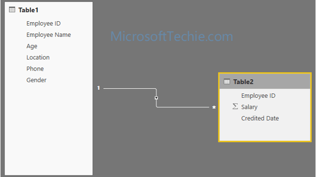
Step 4: Select the “Relationships” button as highlighted below.

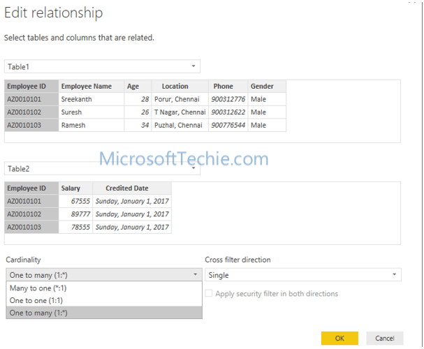
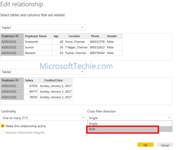
Step 5: The line between the table 1 and table 2 describes the relationship between them. Power BI will automatically match the column name and detects the relationship between each other. Table 1 has unique record for the employee and Table 2 has many records for each employee. So it’s a one-to-many relationship.
Step 6: Cross filter direction has two options – “Single” and “Both”. Let’s create a report for the “Single” cross filter direction.
Step 7: Navigate to the “Report” button to design the report.

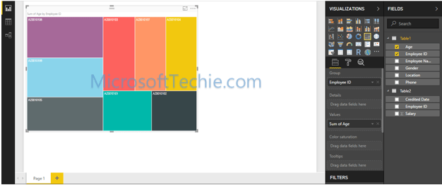
Step 8: Drag and drop the “Tree Map” control and assign the values as shown below. Assign “Employee ID” from table 1 into “Group” property and assign “Sum of Age” in Values property.
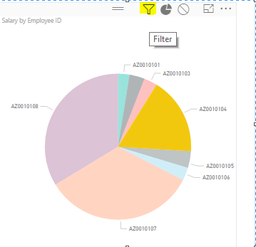
Step 9: Drag and drop “Pie chart” as shown below. Assign “Legend” with “Employee ID” from Table 2 and assign “Salary” from table 2 in Values property.
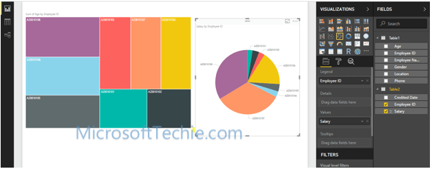
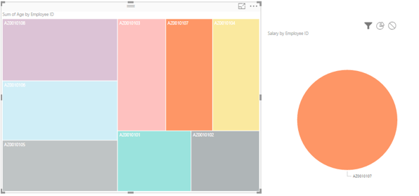
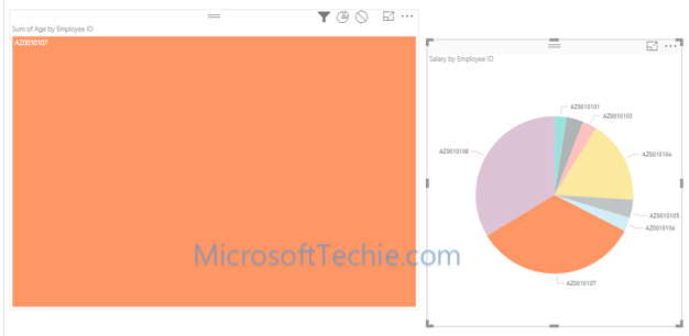
Step 10: Click on any one boxes in the “Tree map”. You will notice that the data from Table 2 is also filtered in “Pie chart” as sub set.
Step 11: To change the interaction between two elements, there is a provision in Power BI to toggle the filter view. Click on Tree map and select “Format” –> Edit Interactions” option.
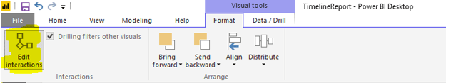
Step 12: This will show option to edit the interaction in each chart. Select the filter option in pie chart as shown below.
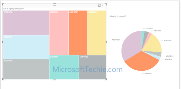
Step 13: When you select the box in “Tree map”, the pie chart will automatically filter itself instead of highlighting it.
Step 14: If you select a pie in Pie chart, the data in the tree map is not filtered or highlighted.
Step 15: This is because, the cross filter condition is assigned as “Single”. Change the filter condition as “Both” in relationship tab as shown below.
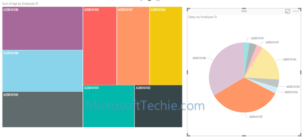
Step 16: Select the report design and click on a pie in Pie chart. The tree view will be automatically filtered as shown below.
Homework
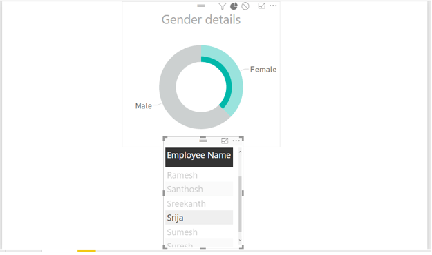
Create a report with the same input file. Create a pie chart for Gender and create a table below to show the list of employee name that are selected. When user selects any record in grid, the pie chart should also filter itself.